BurnDown vs BurnUp chart - Scrum
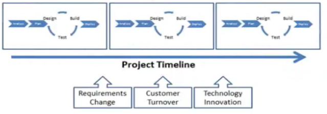
A:Scrum is an Agile approach of software development where software development is released in iterations (Incremental approach) and at the end complete product is delivered where customer needs are met unlike traditional waterfall approach where requirements can't be updated / modified during development cycle.

There are various methods to track project status. Scrum uses BurnDown and BurnUp charts to track progress and demonstrate change using graphs.This helps in project forecasting as well.
BurnDown Chart:
A burn down chart is a graphical representation of work left to do versus time. The outstanding work (or backlog) is often on the vertical axis, with time along the horizontal. That is, it is a run chart of outstanding work. It is useful for predicting when all of the work will be completed.
Progress on a Scrum project can be tracked by means of a release burndown chart. The ScrumMaster should update the release burndown chart at the end of each sprint. The horizontal axis of the sprint burndown chart shows the sprints; the vertical axis shows the amount of work remaining at the start of each sprint.
i.e. It shows the estimated work remaining. It shows the total effort against the amount of work we deliver each iteration.

BurnUp Chart:
A burn up chart, or burnup chart, tracks progress towards a projects completion. In the simplest form of burn up chart there are two lines on the chart:
- A total work line (the project scope line).
- A work completed line.
A burnup chart clearly shows both completed work and project scope. The project will be completed when the lines meet.
The vertical axis is amount of work, and is measured in units customized to your own project. Some common units are number of tasks, estimated hours or story points (in agile project management methodologies). The horizontal axis is time, usually measured in days.
The advantage of a burn up chart over a burn down chart is the inclusion of the scope line. It clearly tracks when work has been added to or removed from the project. It also allows you to visualize a more realistic completion date for the project, by extending a trend line from the scope as well as the completion line. Where the two trend lines meet is the estimated time of completion.
i.e. It shows the project accomplishments in sprints, projection vs reality.

Note:Burn down and burn up charts are two types of charts that project managers use to track and communicate the progress of their projects. A burn down chart shows how much work is remaining to be done in the project, whereas a burn up chart shows how much work has been completed, and the total amount of work. These charts are particularly widely used in Agile and scrum software project management.

Burndown and Burnup charts in Scrum are crucial tools for project management. While Burndown tracks remaining work over time, Burnup illustrates work completed. How Better Get Both offer insights into team progress, aiding in sprint planning and delivery forecasting.
ReplyDeleteGreat read tthanks
ReplyDelete